Comparison of Bike Share Programs between Toronto and New York City
By Jennifer Huynh
Contents
Introduction
A bike share station recently popped up in my quaint neighbourhood of the Bloor West Village in Toronto. I had heard about the bike share program from friends, however, I had never used them myself. Upon further research into this system, I found that there is a JSON API from Open Data Toronto that shows the number of rides and stations within the city. Digging deeper, I also found a series CSV files of trip data organized by quarter. From this, I decided to do some analysis into the demographics of the bike share users.
I was also interested in comparing the Toronto data with another city, so I found an additional API for the New York City bike share system, Citibike. I have plotted all the station for both Toronto and NYC. How will the ride data compare between the two major cities?
The tools used for this project are as follows:
-
Jupyter Notebook for Python analysis,
-
Python libraries: JSON, Pandas, Glob, Matplotlib, Seaborn,
-
JavaScript with the leaflet.js library to plot the map of the Toronto and New York City bike stations,
-
HTML and Bootstrap CSS to visualize and present the data.
The following is a table view summary of Toronto's and New York City's bike share numbers at a glance:
| Toronto | New York City | |
|---|---|---|
| Population | 6,471,850 | 8,398,748 |
| Name of Bike Share Program | Bike Share Toronto | Citibike |
| Number of Bike Stations | 463 | 935 |
| Capacity of Bike Stations | 8332 | 29,446 |
| Number of Rides (2018) | 1,826,362 | 16,723,697 |
| Number of Subscribers (2018) | 1,551,044 | 15,100,440 |
| Number of Casual Riders (2018) | 275,318 | 1,623,262 |
| Average Ride Time (2018) | 728 seconds / 12.1 minutes | 710 seconds / 11.8 minutes |
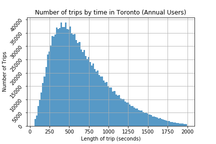
Toronto Bike Share User Demographics
The dataset for Toronto was found in Open Data Toronto, which is a site that contains numerous datasets and information on the City of Toronto. The dataset contained information on specific trips like duration, start stations and end station. There is a total of 1,922,954 data points.
From this dataset, I first explored the data and took out outliers from the upper and lower interquartile range. After cleaning the data, I had 1,826,362 trips left to analyze and plotted the trip using Matplotlibs and Seaborn, the plots are as follows:
.png)
.png)
From the graphs, it looks like the most popular trip duration is about 400 seconds (about 6 minutes). This time was shorter than I had expected, however seeing that the stations were so close together, it makes sense for annual subscribers, who have unlimited rides, to use the bikes frequently and at shorter intervals.
Casual Riders vs. Annual Subscribers in Toronto
As shown in the table above, in 2018, Toronto had 1,551,044 subscribers and 275,318 casual users. However, the duration of the trips varied wildly for these users. The two graphs below shows a comparison of the duration of trips by casual riders and subscribers.
.png)
| Casual Riders | Annual Subscribers | |
|---|---|---|
| Total Number of Trips (2018) | 275,318 | 1,551,044 |
| Average Trip Time (2018) | 1043 seconds / 17 minutes | 672 seconds / 11 minutes |
Using Seaborn, I was able to visualize the probability of each ride length of casual riders and subscribers.
.png)
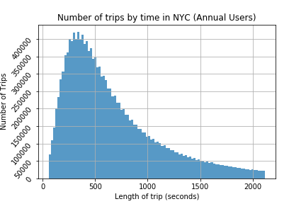
New York City Bike Share User Demographics
The dataset for Citibike contained relevant information to perform the same analysis that was done for the Toronto bike share program. In addition to the standard data for rides, the dataset for New York had additional demographical information including the birth year of subscribers and gender. I also used this information to perform additional analysis to further my understanding of the demographics of the bike users.
In comparison, the NYC dataset had 17,548,339 data points, much higher than Toronto's. After cleaning the data, and removing all the outliers, there were 15,305,146 data points left. I plotted the graphs as follows:
.png)
.png)
Casual Riders vs. Annual Subscribers in NYC
As shown in the table above, in 2018, NYC had 15,100,440 subscribers and 1,623,262 casual users. The duration of the trips varied for these users, much like the Toronto dataset. In addition, the general curve is very similar. This shows that casual riders and annual subscribers behave in a similar way in both cities. The two graphs below shows the number of of trips by duration for casual riders and subscribers.
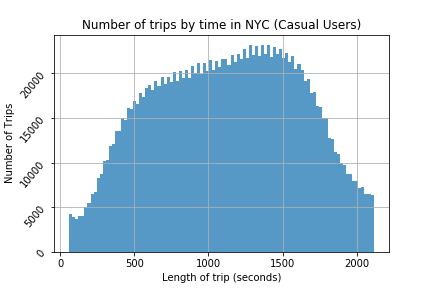
| Casual Riders | Annual Subscribers | |
|---|---|---|
| Total Number of Trips (2018) | 1,623,262 | 15,100,440 |
| Average Trip Time (2018) | 1121 seconds / 19 minutes | 664 seconds / 11 minutes |
.png)
Comparison of Rides by Gender in NYC
Male riders significantly out number female riders. The average ride for females is slightly longer, however, the probability of going long vs. short ride follows the same curve, suggesting very similar biking habits from both genders.
| Male Riders | Female Riders | |
|---|---|---|
| Total Number of Trips (2018) | 11,559,160 | 3,887,520 |
| Average Trip Time (2018) | 659 seconds / 10.9 minutes | 748 seconds / 12.5 minutes |
.png)
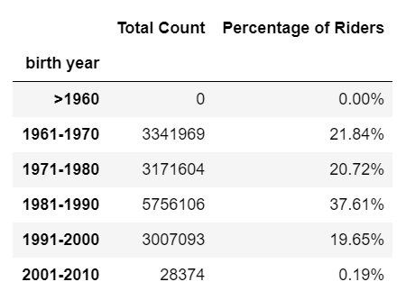
Comparison of Rides by Birth Year in NYC
The data ends at 2002, which would make the youngest allowed bikers to be 16 years old (when this data was collected in 2018). The mean birth year of riders is 1981, making the average rider 37 years old. Looking at the dataframe with the years binned by decade, there is a surprising amount of users just before 1970. This looks to be a data collection issue, where the default birth year upon signing up for a membership was set to this year.
.png)
Final Thoughts
The analysis of the Toronto bike share program in comparison to the New York City bike share program was a challenging but interesting one. I was very surprised by the much lower volume of rides in Toronto when compared to New York's numbers. Toronto's population is smaller, however, the volume of trips was still much smaller even when population was taken into account. I was also surprised by how short the average trip was (at around 12 minutes).
Additionally, the New York dataset showed that there was a much smaller number of female riders in comparison to male riders. I did not expect such a large discrepancy.
I am glad that these two bike share programs provides free and open data so anyone can gather insight on these programs. This kind of open access can really help to spread and improve knowledge of this program around the city and I encourage everyone to take advantage of the bike share programs.
For more of my projects, please see my GitHub.